My goal is to publish a book that is indistinguishable to my readers from any novel from a Big Five publisher. It can be done - in fact, finding such a novel is the one thing that finally got me off my butt and pushed me to self-publish ONE.
Just as a traditionally published book has a huge team of professionals behind it, ONE does as well. My plan is to blog about every step of the process from agent-approved manuscript to published book.
Your book's cover is one of the most important things for making sure it reaches the maximum amount of readers.
I know we say that people shouldn't judge books by their covers, but that's ridiculous. Your book's cover is the outward representation of what's inside. If you didn't invest creativity, care, and professionalism into your cover's design, how do you expect your readers to think you did anything differently with the words and story inside?
I had mad cover envy for Trisha Leigh's covers for her The Last Year series, and when she told me her cover designer, Nathalia Suellen, was a freelance cover artist and open to clients, I emailed right away to reserve my spot. I contracted her for both ONE and TWO right then.
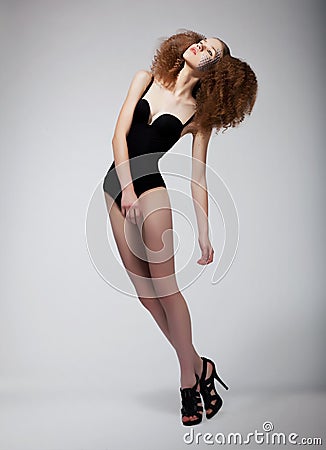
First, she asked me to tell her a bit about the book and give me a description of the main character, if I wanted her on the cover. So I sent her this blurb and the photo I had worked off of when describing Merrin, the main character, in the book:
Then she shot back a few basic questions:
Do you want the girl on the first book and the boy on the second? Or the same girl in both? (you guys will see the answer to that when we reveal TWO's cover.)
Whats your favorite color? (I told her sunset colors were important.)
Is there any important element like an animal or a special necklace? (no, but flight and the sky are big parts of the story and theme.)
I also sent her this image I had found and loved on Flickr:
 |
| (Shot by Lauren Withrow found here.) |
Then, she got to work finding cover models. She sent me a bunch of options and asked me to pick my favorites:
 |
| NO. |
 |
| Beautiful, but it doesn't look like Mer, body, face, hair, or outfit. |
 |
| Gorgeous, but not the right mood. And Mer would never wear that. |
 |
| Cute, but I wanted to see her head. And I hated the shoes. |
 |
| Ohhhh. Now we're getting somewhere. But her eyes are freaky and her hair's wrong. |
 |
| Her face and hair are perfect, even though her hair's the wrong color. But that outfit? Really? And the BRIGHTNESS. *wince* No problem, Nathalia said. We can use a different head and body, and change hair colors. See? |
| (ZOMG NATHALIA IS A GENIUS)
Okay. So then she sent me an idea sketch.
She wanted this skeleton underlaid to show that the characters were a little more than human, and the birds. She really wanted birds. (I did not want the birds, but she really did. And since she's a genius, I let her try them.) |
But the skeleton idea kept freaking me out, so I sent her this instead. What if we tried underlaying THIS on their skin?

So she put the dots back in, but in a totally different way. They're kind of like wings, but not really, they could be like a current or something or just imaginary or WHATEVER THEY ARE PRETTY.
Et voila! Here is the cover we ended up with....
 |
| GORGEOUSSSSSSNESSSSSSS |
Now, Nathalia is nothing if not a perfectionist. So even after I told her I loved the cover, she kept coming up with new versions....
 |
| Meh. |
 |
| Mehhhhhhh. |
I still loved that last one I posted and the one I ultimately used, so
that's what we went with! Yay!!!
Now. I want to say something about this whole cover business.
I'm not normally a self-pub evangelist. I mean, I try to shut up about how much I love being a self-publishing author, and how great it is.
But when it comes to the cover? I cannot. I just can't shut up about how extremely, incredibly, unregrettably DELIGHTED I am that I had complete control, both inspiration and veto-power wise, over this cover.
As I said waaaay up above, your cover is the often the only factor potential readers use to decide whether or not to pick up your book. It's so, so, so important, you guys. And if I wasn't self publishing, I most likely would not have had the fine-tuning control over this most important of book aspects that I had.
So. Basically, this cover business is one of the things that most makes me love, love, LOVE my decision to self-publish ONE. And a HUGE "thank you" is due to Nathalia, for being so patient with me through the whole process, and, of course, creating a GENIUS cover. Genius genius.


I love watching the evolution of this cover, Leigh Ann. My favorite part is actually the DNA wings. I LOVED them and got the symbolism - Mer's love for science plus her longing to fly - right away. GORGEOUS, GORGEOUS, GORGEOUS.
ReplyDeleteI think the cover is gorgeous too and as soon as I saw it, started looking up your designer for future reference (that is, if I EVER finish my book! haha) ...This was a great post to see the progress of how you came to the final version. I've always wondered how you even start something as important as a cover for your book and this sheds some light on that whole mystery. Thanks so much for the post!!!
ReplyDeleteI love this cover, and I love YOU!
ReplyDeleteAhhhh, LOVE seeing the whole process behind the cover! So freaking cool. Nathalia is a total genius.
ReplyDeleteI loved seeing the evoluntion of the book cover, you're great!
ReplyDeleteI LOVED SEEING THE COVER EVOLVE! Never seen it like that before - thank you so much!
ReplyDeleteReally great seeing the cover evolve - and by the way, I haven't had the chance to say: it's beautiful.
ReplyDeleteIts a BEAUTIFUL cover!
ReplyDeleteNathalia truly is talented!!!!
As are you :)
What a beautiful cover! Nathalia, amazing! Love this post. Covers really do catch the eye of the reader. Truthfully it's what pulls you towards the book in a sea of thousands!
ReplyDeleteWow! I always wondered the process of making a cover. Thank you for sharing! It was great to see the creativity and thought process you put into this. It is such a beautiful cover and Nathalia is so talented!!! I think it is awesome that you had complete control on the entire process. I always wondered if some authors hated their covers that the publishing houses created for them.
ReplyDeleteI LOVE your cover. It's stunning! Thanks for sharing how it came together - I love seeing how covers are designed. It's awesome that you had so much control!
ReplyDelete